Introduction
If you’re spending money on Google Ads and sending traffic to a page that wasn’t specifically built for that campaign — you’re likely leaving more than half your budget on the table. That’s not hyperbole. The average landing page conversion rate across all industries sits at around 6.6%, but the gap between median and top performers is enormous. WordStream data shows a median of 2.35%, while the top 10% of advertisers convert at 11.45% or higher. The difference almost always comes down to what happens after the click.
Before diving into the checklist itself, here’s a quick word on infrastructure. Running Google Ads at scale — especially across multiple clients or niches — means you need agency accounts that won’t get flagged, frozen, or throttled.
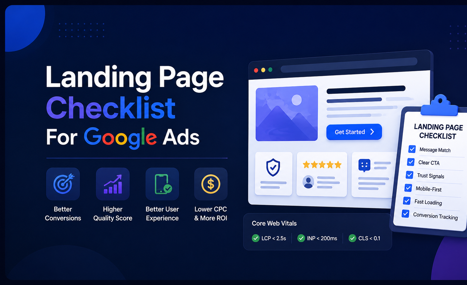
This landing page checklist for Google Ads is built for practitioners — people who are actively running campaigns and need a systematic way to audit, fix, and test their post-click experience. It covers everything from Quality Score mechanics to Core Web Vitals thresholds, from CRO test design to what a proper thank-you page should do. Work through it section by section, and you’ll have a clear picture of where your pages are bleeding performance — and exactly how to stop it.

Google Ads Fundamentals That Influence Landing Pages
Most landing page advice treats the page in isolation. But in Google Ads, the page is part of a system — and understanding how that system scores and prices your traffic is what separates efficient campaigns from expensive ones.
How Landing Page Experience Affects Results
Landing Page Experience (LPE) is one of the three components Google uses to calculate Quality Score, alongside expected CTR and ad relevance. Google’s own documentation describes it as a measure of “how relevant and useful your landing page is to people who click your ad.” In practice, it’s evaluated through crawlers, user behavior signals, and on-page content analysis.
The financial impact of LPE is well-documented. Analysis of non-branded keywords shows that ads rated “Above average” for both landing page experience and ad relevance had CPCs 36% below average — and conversion rates 750% higher than those rated “Below average” for both metrics. That’s not a marginal gain. That’s the difference between a campaign that scales and one that bleeds budget.
Google’s 2025 prediction model update now focuses specifically on navigation experience — how clearly users can understand where they’ve landed and what to do next. The system flags unexpected destinations and poor navigation, and shows fewer ads that lead to confusing or frustrating pages. In other words, the technical bar keeps rising. A page that passed Google’s quality checks two years ago may quietly be dragging your Quality Score down today.
For a Google Ads landing page audit, the LPE column in your Keywords tab is the right starting point. If it shows “Below average,” that’s Google telling you something is wrong — either the page doesn’t match the ad, loads too slowly, or doesn’t give users a clear path forward.

Message Intent
Message match — the alignment between what your ad says and what the landing page delivers — is the most basic requirement of good landing page experience Google Ads, and also the most commonly broken one. If your ad says “20% off all sneakers,” that offer needs to appear prominently when the user lands. Any disconnect creates confusion, increases bounce rates, and damages performance.
Sarah Stemen, President of the Paid Search Association and a recognized PPC strategist with 17 years of Google Ads experience, puts it bluntly: “Landing page clarity — making sure the semantic meaning of your destination matches the prediction — is the new skill set. You can’t steer the ship with a rudder anymore; you have to influence the current.” With Google’s AI systems now making more autonomous decisions about where traffic lands (especially with AI Max’s Final URL Expansion feature), a vague or generic landing page is increasingly risky.
Intent mapping goes deeper than keyword matching. A user searching “enterprise CRM pricing” is in a completely different headspace than someone searching “what is a CRM.” The first wants numbers and a path to a demo. The second wants education. Sending both to the same page — even if it’s technically “relevant” — wastes the intent signal you paid for.
One agency reported conversion rates increasing by up to 60% when clients created dedicated landing pages that perfectly matched their RSA messaging, as opposed to sending all traffic to a general service page. That’s a number worth building dedicated pages for.
Lead Gen vs. Ecommerce
The structure of a high converting Google Ads landing page looks very different depending on your conversion goal, and conflating the two approaches is a common and costly mistake.
For ecommerce, the job of the landing page is to remove friction between intent and purchase. eCommerce ads push shoppers toward a product detail page and checkout — the success metric isn’t “how many people filled out a form,” it’s purchases, revenue, and return on ad spend. That means clear product imagery, price visibility, shipping info, and a checkout flow that doesn’t make people think. Navigation can exist here — but only enough to help users find related products, not enough to pull them away from the conversion path.
For a Google Ads lead gen landing page checklist, the dynamic is different. The page is asking for trust before the transaction happens. Lead generation takes place early in the sales cycle and ideally leads to a long-term commitment or a large purchase — so reducing friction around the form fill is the primary goal, not closing the deal on the spot. That means fewer fields, more social proof, and a clear explanation of what happens after someone submits.
Top-performing lead gen pages reach conversion rates of 20–30%, while even average performers hit 9–12% by keeping form fields minimal and tightly aligning page content with audience intent. The ecommerce benchmark sits closer to 4.3% on average, with transactional intent and limited-time offers pushing the best pages higher.

The practical implication: your Google Ads ecommerce landing page checklist and your lead gen checklist are not the same document. Build them separately, optimize them separately, and measure them against different benchmarks.
Pre-launch Checklist
Most campaigns fail at setup, not at optimization. The decisions you make before the page even goes live — what you’re measuring, what intent you’re targeting — determine everything downstream. Spending an hour on this stage properly can save weeks of confused optimization later.
Define the Conversion and Success KPI
The most common pre-launch mistake isn’t a technical one. It’s treating every form fill, phone call, and “add to cart” as equally valuable and letting Google optimize toward all of them simultaneously. If you count both “add to cart” and “purchase” as primary conversions, the algorithm may chase micro-conversions — leaving you with great CPA numbers and an empty pipeline.
Before the page launches, nail down one primary conversion action per funnel stage. For lead gen, that’s typically a qualified form submission or booked call — not a newsletter signup. For ecommerce, it’s a purchase, not a product view. Starting from November 2025, new conversion goals created via the Google Ads API are no longer automatically set as account-default goals — which means you now need to explicitly mark your primary conversion as biddable, or Smart Bidding will have nothing meaningful to optimize toward.
Your success KPI for the landing page itself should sit one level above just “conversion rate.” The real questions are: what’s the cost per qualified lead (not just any lead), what’s the lead-to-close rate from this page versus others, and what does downstream revenue look like per session? A landing page that wins on conversion rate but produces lower-quality leads is not a winner — it’s a volume trap.
Set these thresholds in writing before launch, not after results come in. It sounds obvious. Most teams skip it and end up arguing about whether a test “worked” based on whichever metric flatters the variant they wanted to win.
Map Intent
Intent mapping is where the Google Ads landing page checklist starts doing real work. The job here is to match every ad group’s keyword intent to a specific page version — not a generic page, not your homepage, a page built around the specific mindset of someone who typed that query.
There are three intent layers worth separating. Informational queries (“how to reduce CPA in Google Ads”) need educational framing — the page should teach something before it asks for anything. Commercial queries (“Google Ads agency pricing”) mean the user is comparing options, so the page needs differentiation, not education. Transactional queries (“hire Google Ads consultant”) mean the user is ready to act and wants the friction removed immediately.
For transactional intent, link directly to pages where services or products can be purchased or booked immediately, with clear pricing and a direct path to action — and use the Dynamic Keyword Insertion tool carefully to boost ad relevance by ensuring the user’s search term appears in your headline.

The practical approach to this Google Ads conversion landing page checklist step: pull your top 10–15 keywords by spend from the last 90 days, classify each by intent type, and check whether the current landing page you’re sending them to actually matches. In most accounts, at least a third of spend is hitting the wrong intent layer. That’s budget working against itself.
Content and Copy Checklist
A page can be technically perfect — fast, mobile-friendly, structured correctly — and still convert badly. Copy is where most of the real work happens, and it’s also where most generic advice fails because it’s too vague to act on.
Headline and Subheadline
The landing page headline checklist starts with one test: can a stranger read your headline and know within five seconds what you’re offering and why it matters to them? If they have to read three paragraphs to figure out what you offer, you’ve already lost them.
Headline and message match with the ad is non-negotiable. If your ad promises “Free Website Audit,” your landing page headline should reflect that exact offer — confirming to the visitor they’ve arrived in the right place. This isn’t about repeating the ad verbatim; it’s about delivering on the expectation set by the click.

The subheadline does different work. Use it to elaborate on the headline — describing the offering in more detail or highlighting a key feature. For example: “Fast, 24/7 emergency call-outs and transparent, fixed-price repairs for your home or business.” That’s specific, that’s useful, and that’s the kind of language that actually builds confidence.
One thing worth flagging: a headline that’s “clever” is almost always worse than one that’s clear. HubSpot’s CRO team consistently points out that outcome-focused headlines outperform brand-voice headlines on paid traffic, because ad visitors arrive with zero brand context and high intent. Changing a single CTA from “Sign up for free” to “Trial for free” produced a 104% increase in trial start rate in one documented test, which shows how much specific word choice matters even in short copy.
Benefit Bullets and Feature-to-Benefit Mapping
The landing page copy checklist principle here is simple: visitors don’t care about features. They care about what changes for them after they use the product or service. “256GB storage” is a feature. “Never delete a photo again” is a benefit. The first makes you think. The second makes you feel something.
Bullet lists on a landing page work best when each point answers “so what?” after the feature statement. The structure that converts: state the feature briefly, then pivot immediately to the outcome it creates for the specific type of visitor you’re targeting.
For a Google Ads lead gen landing page checklist, benefit bullets should address the specific pain implied by the search query. Someone searching “Google Ads agency for law firms” is not looking for generic “we improve your ROI” language. They want evidence you understand the compliance constraints of legal advertising, the competition in their market, and the lead quality problem every law firm faces with paid search.
Research from Imagescape found that shortening forms from 11 fields to 4 produced a 120% increase in conversions — but the same logic applies to benefit sections. Cut everything that doesn’t answer the visitor’s core question. Three punchy, specific benefit bullets will outperform six vague ones every time. The same discipline applies to your form: a landing page form optimization checklist should confirm that every field has a direct business justification — if you can’t explain why you need someone’s job title before they download a guide, cut it.
Objection Handling
Every visitor arrives with objections. The question is whether your page addresses them or pretends they don’t exist. For a Google Ads compliance landing page, price, commitment level, and “is this legit?” are the most common barriers. For ecommerce, it’s shipping time, return policy, and whether the product actually delivers on what the photo shows.
The technique is to identify your three biggest conversion-killing objections — you can find them in chat transcripts, in sales call recordings, or simply by asking your last ten customers what almost stopped them from buying — and address each one directly in the copy, near the CTA.
Don’t bury objection handling at the bottom of the page in a FAQ that nobody reads. Use time-sensitive language near the CTA — phrases like “cancel anytime” or “no contract required” reduce the perceived commitment and lower the psychological barrier to clicking. Place the objection response within visual range of the conversion action.
CTA Clarity
The landing page CTA checklist is short: one primary action, above the fold, repeated at natural scroll breakpoints, with language that tells the visitor exactly what happens next.
Studies show that landing pages with a single offer and a clear CTA see a 13.5% conversion rate, compared to pages with multiple competing offers. The moment you add a second CTA of equal visual weight — “Book a call” and “Download the guide” side by side — you’ve forced a decision that many users resolve by doing neither.
The button text matters more than most people think. “Submit” and “Get Started” are placeholders, not CTAs. Specific language that describes the outcome (“Get My Free Audit,” “Start Saving on CPC,” “See Pricing for My Industry”) consistently outperforms generic verbs in A/B tests across industries. Around 38% of visitors will leave a page if the CTA is unclear. That’s a number that should make any PPC manager uncomfortable.

Trust Content
Trust signals on a landing page for Google Ads aren’t decoration — they’re doing active conversion work, especially for cold traffic that has no prior brand exposure. Customer testimonials with a name, photo, and a concrete result — “We grew signups 300% in three months” — build credibility faster than anything you can say about the product yourself.
The landing page trust signals checklist covers: real testimonials with identifiable names and company affiliations, review scores from third-party platforms (Google, Capterra, G2), recognized client logos, and security badges near the form. For B2B, case study snippets with specific metrics work harder than star ratings because the audience is doing ROI math before they click.

Aleh Barysevich from SEO PowerSuite shared in a Databox case study how one specific change drove measurable improvement: “Adding the G2 rating icon to the form improved our conversion rate — this small addition has a big impact, lending credibility and building trust.” It takes five minutes to add a badge. It’s been tested repeatedly by real teams. There’s almost no reason not to do it.
One mistake that keeps showing up: trust content placed only at the bottom of the page, after the CTA. Most visitors on paid traffic don’t scroll that far. Put at least one trust signal — a review count, a recognizable logo strip, a short quote — in the above-the-fold zone, within the same eyeline as the headline.
Checklist Design
Good design for a Google Ads landing page isn’t about aesthetics. It’s about removing every possible reason for a visitor to hesitate or get confused before they hit the conversion point. The visual structure of the page either accelerates that decision or quietly sabotages it.
Above-the-Fold Layout and Visual Hierarchy
The space visible on screen before any scrolling is the most valuable real estate on the page. Above the fold attracts 84% more attention than content below it, and visitors spend 57% of their viewing time in this zone — which means if your headline, CTA, and at least one trust signal aren’t there, most of your paid traffic never gets to see them.
The above-the-fold section has one job: answer three questions instantly. Where am I? What can you do for me? Why should I trust you? This means your headline, subheadline, primary CTA, and at least one trust signal must all be visible without scrolling on both desktop and mobile.
One team that builds landing pages at scale describes a consistent pattern: pages where the above-the-fold section matches the ad message word-for-word convert 20–35% higher than pages with even slight mismatches. They tested this across 300+ client accounts — that’s not a hypothesis, that’s a pattern. One specific case they documented: simplifying the above-the-fold section on Flare.io’s “Book a Demo” page to match the exact language of their ads increased demo conversions by 65% within one week.
Visual hierarchy within that zone matters too. Use size contrast to make the headline impossible to miss, directional cues (arrows, faces looking toward the form, whitespace flow) to guide the eye toward the CTA, and keep decorative elements out of the critical path. A CRO audit framework recommends one high-impact trust signal above the fold — a Google reviews star rating, an industry certification badge, or years in business — as the single change that most reliably moves conversion rates on local and B2B pages.
Mobile-First
Since 60% of Google Ads clicks come from mobile devices in 2026, mobile experience heavily influences Quality Score Ryze AI — and if your page was designed for desktop first and “made responsive” as an afterthought, it almost certainly has friction problems you haven’t noticed because you’re reviewing it on a laptop.
Mobile-first means building for the smallest screen before scaling up. In practice: single-column layout, full-width CTA buttons sized for thumb interaction (minimum 44×44 pixels per Google’s own touch target guidelines), form fields large enough to tap without zooming, and no auto-playing popups that trigger immediately on load.
Shopify’s mobile landing page design for its free trial is worth studying. The page reduces the entire above-the-fold experience to a single email input field and a CTA button, with risk-reduction copy directly below it: “no credit card required, cancel anytime.” Two short lines dissolving the two most common objections, placed exactly where a thumb naturally rests. That’s not minimalism for its own sake — it’s deliberate friction removal at every touch point.
The mobile landing page UX checklist for ads also includes: confirm your headline and CTA aren’t pushed below the first screen on phones (test in portrait mode on an actual device, not just browser DevTools), lazy-load offscreen media, and avoid side-by-side button layouts that force users to make precise taps.
Navigation Rules
The rule here is simple and consistently violated: dedicated Google Ads landing pages should have no main navigation. Minimize distraction by isolating the Google Ads landing page from the rest of the website — strictly no navigation.
Every link you add to a landing page is a potential exit. The header menu that exists on your main site — with product pages, about pages, pricing tabs, blog links — is designed to help organic visitors explore. That same menu on a paid landing page actively undermines the conversion goal by giving a distracted visitor an easy way to wander off without ever taking action.
Footer links are equally problematic. Keep only what’s legally required (privacy policy, terms) and what builds trust (contact info for service businesses). The Google Ads landing page design checklist principle is: one page, one goal, one path forward.
Readability
Copy that’s hard to read doesn’t get read. This affects conversion directly and also sends negative engagement signals that feed back into your landing page quality score Google Ads assessment.
Practical readability rules for paid traffic: body text at 16px minimum (18px is better for mobile), line height at 1.5–1.6em, paragraph length capped at three to four sentences, and headers that are scannable enough to communicate the core offer even if the visitor reads nothing else. Keep it light above the fold — put your best content there but not everything. Tease the story. Earn the scroll.
Contrast matters more than most designers acknowledge. A CTA button that blends into a white background is a conversion problem, not a styling preference. Use contrasting colors for CTA buttons against the page background, and apply the same logic to any inline link or form field that requires user action. Taken together, these rules form the core landing page UX checklist for conversions: readable body text at 16px minimum, clear visual hierarchy between headline and CTA, scannable subheadings that communicate the offer independently, and zero decorative elements that compete with the conversion path.
Thank-You Page and Post-Conversion Experience
The thank-you page is where most teams stop caring — which is exactly why it’s an underused opportunity. It’s the one moment where the visitor has already said yes, trust is at its highest, and there’s no friction left to remove.
For lead gen campaigns, the thank-you page should confirm what just happened, set expectations for next steps (“We’ll call you within one business day”), and offer a secondary action — a relevant resource download, a calendar booking link, or an invitation to follow on LinkedIn. Don’t send people to a blank “Thank you, we’ll be in touch” screen and call it done.
For the Google Ads tracking checklist, the thank-you page URL is also the most reliable place to fire your Google Ads conversion tag. It loads only after the form submits successfully, which eliminates double-counting issues and gives Smart Bidding a clean signal to optimize from.
Checklist Technical Performance
Pages that load slowly are expensive in Google Ads — not just because users leave, but because Google directly factors page speed into the quality assessment that sets your CPC. Getting the technical side right isn’t optional on a paid landing page.
Core Web Vitals Targets and Why They Matter
Google’s official Core Web Vitals thresholds (last updated December 2025) are: LCP (Largest Contentful Paint) under 2.5 seconds, INP (Interaction to Next Paint) under 200 milliseconds, and CLS (Cumulative Layout Shift) under 0.1. These are measured at the 75th percentile of real user sessions — meaning 75% of your actual visitors need to hit those numbers, not just the median.
According to the 2025 Web Almanac, only 62% of mobile pages achieve a good LCP score, making it the hardest Core Web Vital to pass. The practical implication: if you haven’t specifically optimized your landing page for LCP, there’s a better than one-in-three chance it’s failing on mobile — and that’s silently raising your CPCs.
INP replaced First Input Delay (FID) in March 2024, and the distinction matters. INP captures something FID never did — the sustained responsiveness of your entire page, not just the first interaction. Your site might respond instantly to the first click, but if it gets slower with each interaction, that’s now measurable. For landing pages with multi-step forms or interactive elements, this is where many pages that “feel fast” are actually failing.
One global e-commerce platform achieved an 18% decrease in bounce rates by improving LCP from 4.1 to 2.2 seconds, with the same optimization effort resulting in a 12% lift in conversion rates through INP improvements. Those aren’t marginal gains from a technical exercise — they’re the kind of numbers that change campaign unit economics.
Page Weight
Heavy pages kill mobile performance faster than almost anything else. The LCP element is an image — and that image is almost always the first optimization target.
Compress all images to WebP format (25–35% smaller than JPEG at equivalent quality), use responsive images with srcset so mobile devices don’t download a 1920px hero, and preload the LCP image in the document <head> with fetchpriority=”high”. On a standard landing page, those three changes alone can reduce LCP by 800ms or more.
Beyond images, 40–60% of the JavaScript executed by an average website comes from third-party scripts — analytics tags, chat widgets, heatmap tools, ad pixels. Each one adds latency to INP. Audit them: load non-essential scripts with defer, use facades for heavy widgets (show a static image of a chat button and only load the real widget on click), and cut anything that doesn’t have a direct impact on conversion tracking.
Caching, Compression, CDN, and Critical Rendering Path
Enable Brotli compression on your server (it outperforms Gzip by 15–20% on text assets). Set appropriate cache headers for static assets — CSS, JavaScript, images that don’t change between sessions can be cached aggressively without hurting freshness. For landing pages served to global audiences, a CDN reduces latency for users far from your origin server in ways that no amount of code optimization can replicate.
The critical rendering path is what the browser needs to process before it can display anything. Render-blocking CSS and JavaScript in the <head> — external stylesheets, synchronous scripts — delay that first paint. Extract and inline only the CSS needed for above-the-fold content, defer everything else. Server-side rendering or static generation (via Next.js, Astro, or similar) eliminates the JavaScript execution delay that tanks LCP on client-rendered pages.
PageSpeed Insights Workflow and Common Fixes
The standard page speed checklist for landing pages starts at PageSpeed Insights (PSI): run the URL, check both mobile and desktop tabs, and prioritize the Opportunities section over the Diagnostics. Opportunities have direct, measured impact on LCP and INP. Diagnostics are useful context but not always worth fixing first.
The most common quick wins in PSI audits: compress and convert images to WebP, eliminate render-blocking resources (check what’s in <head> that can be deferred), reduce unused JavaScript (particularly from plugins and third-party tools loaded globally but not needed on this specific page), and fix CLS by setting explicit width/height attributes on all images and embedded elements so the browser reserves space before they load.
Run PSI alongside Google Search Console’s Core Web Vitals report — PSI shows lab data for individual URLs, while Search Console shows real-user field data across all your pages. Lab data is useful for diagnosing and testing fixes. Field data is what Google actually uses to assess your landing page experience. When they disagree, field data wins.
Отлично, материала достаточно. Пишу оба раздела с живыми кейсами и человеческим опытом.
Checklist CRO Testing Plan
Most teams do A/B testing sporadically — they get excited after a conference, run one test, get inconclusive results, and go back to guessing. The teams that actually move the needle treat testing as a system, not an event. Here’s how that system works.
What to Test First
The fastest conversion gains almost always come from the same handful of variables: headline clarity, CTA text, form length, and above-the-fold layout. Start there before you get exotic.
Data from thousands of A/B tests shows a clear hierarchy: form length reduction delivers the highest conversion lift at 120%, followed by headline optimization at 27–104%. Both require minimal technical complexity and can be implemented in hours. The case of Imagescape is one of the most-cited in CRO circles for good reason: shortening a form from 11 fields to 4 produced a 120% increase in conversions — no redesign, no new copy, just friction removal.
CTA wording is another high-return, low-effort test. Travel deals platform Going tested two CTAs: “Start Free Trial” vs. “Get Premium Access.” The second option doubled their trial sign-ups. The key takeaway: small text changes that emphasize value and exclusivity can significantly influence user decisions. The underlying principle — people respond to specificity about what they’re getting — shows up consistently across industries.
For a Google Ads landing page A/B testing checklist, the priority stack looks like this. First, test the headline for message match with your top ad groups. Second, test the primary CTA text. Third, test form length or step structure. Fourth, test above-the-fold trust signals. Only after those have been tested and rolled out should you move to layout, imagery, or offer framing. Most teams do this in reverse order and wonder why their “redesign” didn’t move the number.
A/B Testing Hygiene
When advertisers say they’re “A/B testing landing pages,” they often mean they’re running two ads with two different URLs and watching conversion rate. The problem is that modern ad serving prioritizes what it believes will perform best — which skews traffic and makes results hard to trust. A proper landing page A/B test in Google Ads uses the Custom Experiments feature, which creates a campaign split that allocates traffic intentionally between control and variant.
The hygiene rules are non-negotiable:
One variable per test. If you change the headline and the form and the CTA layout simultaneously, you’ll get a result but you won’t know what caused it. That’s not a test — it’s a renovation with a mystery outcome.
A/B tests need at least four weeks and enough conversion volume to be valid. A few days or a handful of conversions prove nothing. Wait for statistically significant differences before calling a winner — and use a significance calculator to verify, not your gut feeling.
Don’t run tests during volatile periods. Black Friday, major holidays, and product launches all skew behavior in ways that will make your results unreliable. If you’ve launched a test three days before a seasonal peak, pause it and restart after.
A landing page that wins on conversion rate but produces lower-quality leads is not a winner — it’s a volume trap. This is especially painful in B2B lead gen where a 40% jump in form fills might just mean you lowered the friction enough for unqualified visitors to submit. Always validate test winners against downstream metrics: lead-to-demo rate, lead-to-close rate, or revenue per session — not just raw conversion count.
Landing Page Experiment Design and Guardrails
Custom Experiments in Google Ads offer two split options: cookie-based (a user always sees the same version across multiple searches) and search-based (each search is randomly assigned). For landing page tests, cookie-based splitting gives you a cleaner user experience — the same visitor doesn’t encounter both variants in the same week — but search-based gets you to statistical significance faster on lower-volume campaigns.
Write the hypothesis before you launch. “Landing Page B will increase qualified lead rate by reducing form fields from seven to three while maintaining the same CTA offer” is a hypothesis. “Let’s see if the new page does better” is not. The discipline of writing a hypothesis forces you to define what winning actually looks like — and stops you from retroactively deciding that a secondary metric was the real goal all along.
During the test, lock down Final URL behavior — if you’re running Performance Max with Final URL Expansion enabled, Google can quietly reroute traffic to different pages on your domain, which completely invalidates a landing page experiment. Disable Final URL Expansion for any campaign where you’re running a controlled landing page test. We’ve seen this mistake erase weeks of clean test data in accounts that had no idea it was happening.
Personalization and Dynamic Content: When It Helps vs. Harms
Dynamic text replacement — changing the headline on a landing page to match the user’s search query — is one of the most consistently effective personalization tactics for Google Ads. Using dynamic elements like targeted CTAs can improve conversion rates by 31% in documented examples, and dynamic pages can boost revenue by up to 15% compared to static pages.
The practical entry point is keyword insertion in the headline via URL parameters. If someone searched “Google Ads agency for SaaS” and your headline auto-populates to include that phrase, the page feels immediately relevant in a way that a generic “Grow Your Business with Paid Search” headline never can. Glamnetic, a beauty brand, went further: they deployed Nostra AI’s Edge Delivery Engine to cut page response time from 550ms to 85ms while keeping heavy visual content. The result was a 120% gain in conversion rate — speed and relevance working together rather than trading off against each other.
But there’s a ceiling on how much personalization helps, and it’s easy to cross it. Google has started incorporating on-site behavior and navigation patterns into its landing page scoring — meaning thin content, keyword stuffing, or auto-swapped text blocks can actually lower your Quality Score even if you’re personalizing. The page must still be cohesive, functional, and easy to navigate. One documented failure case: a company that personalized 14 different elements simultaneously — headlines, subheadlines, feature lists, testimonials, pricing, CTAs, images, color schemes — saw performance collapse because visitors experienced cognitive overload rather than relevance. The page felt like random elements assembled for no one in particular.
The rule: personalize the headline and CTA to match keyword intent. Leave the underlying structure, proof points, and offer consistent. That’s the version of dynamic content that reliably helps.
Post-Test Documentation and Rollout
A test result without documentation is just an anecdote. The next person on your team — or future-you six months from now — needs to understand what you tested, why, what happened, and what decision you made. Without that trail, teams run the same test twice, apply learnings inconsistently, and lose institutional knowledge every time someone changes roles.
The minimum viable test record: hypothesis, start and end date, pages tested, traffic split, primary KPI, result with statistical confidence level, decision made, and date rolled out. Keep it in a shared doc or a project management tool. It takes fifteen minutes to write after each test and it pays back that investment every single time.
On rollout: when an experiment wins in Google Ads, you can apply it back to the original campaign directly from the Experiments dashboard. The new winner then becomes the control for your next test. That’s the compounding model — each win raises the baseline, and each test starts from a stronger position than the last. School of Rock ran this process systematically: agency RevUnit audited their PPC campaigns, identified slow-loading pages and inconsistent landing page messaging across 160 franchise locations, built a template page, and tested it. Monthly conversions increased by 250% — five times previous levels — and cost per conversion dropped by 82%. Not from a single brilliant idea, but from a disciplined process applied at scale.
Audit Scorecard and Prioritization
The sections above cover every layer of a high-performing landing page. But in practice, nobody has unlimited time and budget to fix everything simultaneously. The scorecard and prioritization framework below gives you a way to triage.
Quick Scorecard
Run this against any landing page before or after a campaign launch. Score each item as a pass (✓), needs work (⚠), or failing (✗). Anything failing should be addressed before scaling spend.
The message match check: does the H1 headline reflect the specific offer or value in the ad that sends traffic here? Not “close enough” — exact or near-exact mirror. A mismatched headline is one of the single most common causes of high bounce rate on paid traffic, and pages with tight ad-to-headline message match convert 20–35% higher than pages with even slight mismatches, based on analysis across 300+ client accounts.
The speed check: run the URL through PageSpeed Insights on mobile. If LCP is above 2.5 seconds or the mobile score is below 70, flag it. Then check the Google Ads Keywords tab for the “Landing Page Exp.” column — “Below average” here is a direct signal from Google that something is wrong.
The conversion architecture check: is there a single, clear CTA above the fold? Is navigation removed or minimal? Is there at least one trust signal visible without scrolling? Is the form asking for only what’s strictly necessary?
The tracking check: is the conversion tag firing correctly on the thank-you page? Are UTM parameters passing through to GA4? Is the Google Ads conversion action set to track the right goal (not a page view, not an add-to-cart that was meant to be secondary)? Think of this as your landing page tracking checklist for Google Ads: conversion tag on thank-you page, UTM parameters passing into GA4, primary conversion goal set as biddable, and offline conversion import configured if your sales close outside the platform.
The mobile check: open the URL on an actual phone in portrait mode. Can you read the headline without zooming? Is the CTA button easy to tap with your thumb? Do form fields activate the correct keyboard type (email fields should trigger the email keyboard)?
Common Failure Patterns by Niche
Different industries and campaign types fail in predictable ways. Knowing the pattern for your niche saves the time of diagnosing from scratch.
In the home services niche (plumbers, electricians, HVAC), the most common failure is sending Google Ads traffic to a general services homepage instead of a campaign-specific page. Taylor Made Marketing regularly achieves 35% conversion rates in home improvement — compared to a 3–5% industry average — by building dedicated pages per service type and per geography, with a form that asks only for name, phone, and zip code. Every extra field they remove improves conversion. The trust signal that moves the needle most in this niche: a real photo of the technician who will show up, with a name, versus a stock image of someone in a generic uniform.
In SaaS and B2B, well-executed landing page optimization frequently delivers 20–50% conversion rate lifts, and B2B SaaS companies often see 30–60% cost per lead reductions when pages align with buyer intent and remove friction. The most common failure pattern here is burying the pricing or packaging information, forcing visitors to book a demo just to find out if the product is in their budget. If your ICP can afford what you sell, showing a price range doesn’t lose them — it qualifies them faster. The second most common failure: a form with more than five fields that isn’t multi-step. Multi-step forms consistently outperform long single-page forms in this category because the first step feels low-commitment.
In ecommerce, the landing page quality score checklist failure almost always comes back to product-page traffic that lacks campaign-specific framing. Sending Google Ads traffic to a standard product detail page — the same one organic visitors see — means you’re paying for clicks that land on a page with navigation, related products, footer links, and no campaign-specific headline. University of Nevada, Reno ran into a version of this problem: broad keyword targeting was sending paid traffic to generic pages that didn’t match what the ads promised. After HawkSEM restructured campaigns and launched program-specific landing pages with targeted copy and dedicated contact forms, lead quality and volume both improved substantially.
In the legal and financial services niches, the failure pattern is almost always trust deficit: the page looks like it was built in an afternoon, with no attorney photos, no firm credentials, no case results, and a form asking for detailed personal information before establishing any credibility. The fix is front-loading proof — bar association membership badges, years in practice, recent case outcomes (where regulations permit), and client testimonials with full names and case types — before the form ever appears on screen.
Conclusion
Working through a complete landing page checklist for Google Ads isn’t a one-time project — it’s a recurring discipline. The accounts that consistently outperform their benchmarks aren’t the ones with the biggest budgets. They’re the ones that treat the post-click experience with the same rigor they apply to bidding, audience targeting, and creative.
The core logic of everything covered here comes down to one chain: better landing page experience raises Quality Score, which lowers CPC, which means more traffic for the same spend, which gives you more data to test with, which compounds into increasingly efficient campaigns. Michelle Morgan, co-founder of Paid Media Pros and a 12-year Google Ads veteran, describes 2026 as a year where richer landing pages with clearer value messaging will separate brands that show up in AI-powered search from those that don’t. The page is no longer just a conversion tool — it’s an eligibility signal for where your ads appear. That’s exactly why the decision to improve landing page for Google Ads — before scaling spend — is always a better investment than raising bids on a page that’s already leaking conversions.
The prioritization from this guide, distilled to a practical sequence: fix message match first (it’s the highest-return, lowest-cost change in almost every audit), then speed (LCP and mobile experience compound directly into CPCs and Quality Score), then conversion architecture (single CTA, removed navigation, trust signals above the fold), then testing (structured experiments that build institutional knowledge over time). Don’t try to do all of it simultaneously on every page. You’ll get 80% of your Quality Score improvements from 20% of your optimization work — the smart move is to find those few high-impact changes rather than trying to fix everything at once.
The Google Ads landing page audit that matters most is the one you do now, on your highest-spend campaigns, with fresh eyes and the specific checkpoints from each section of this guide. Pull up your Keywords tab, look at the Landing Page Exp. column, and find the “Below average” rows. That’s the starting point. Everything else follows from there.
FAQ
What makes a landing page compliant with Google Ads policies?
Understanding Google Ads landing page requirements starts with accessibility and transparency: the page must load correctly for Googlebot, must not require a login to view, and must reflect the exact offer stated in the ad. The page must be accessible — it can’t block Googlebot or require login to view. The content must match what the ad promises: if the ad says “free trial,” the page needs to actually offer a free trial without burying conditions that make it meaningless. The page must have clear contact information and a working privacy policy if you’re collecting personal data. Beyond hard policy requirements, Google’s quality systems also evaluate whether the page provides a genuine, navigable experience — pages that auto-redirect, load excessive pop-ups on arrival, or use deceptive design patterns will get flagged. The practical Google Ads compliance landing page checklist: ensure HTTPS, confirm the page loads correctly with Googlebot enabled, match the ad’s offer on the landing page without bait-and-switch, include a visible privacy policy link if there’s a form, and avoid aggressive interstitials that cover the content immediately on load.
How does landing page experience affect Quality Score and CPC?
Landing page experience is one of three components that feed into Quality Score, alongside expected CTR and ad relevance. When the landing page experience score is “Above average,” Google interprets the full ad-to-page chain as relevant and useful — and rewards it. Data from non-branded keywords shows that ads rated “Above average” for both landing page experience and ad relevance had CPCs 36% below average and conversion rates 750% higher than those rated “Below average” for both metrics. In practice, a poor landing page experience means you’re paying more per click than competitors with better pages targeting the same keywords, even if your bid is identical. The mechanism: a higher Quality Score improves Ad Rank, which can secure better position at a lower actual CPC than competitors who are overbidding with weak Quality Scores.
What should a Google Ads landing page include for higher conversions?
A high converting Google Ads landing page needs five things working together. First, a headline that matches the specific promise of the ad that sent the visitor there — not a generic tagline, but direct message match. Second, a benefit-focused subheadline that answers “so what?” without making the visitor think. Third, a single primary CTA above the fold with specific action-oriented text (“Get My Free Audit” beats “Submit”). Fourth, at least one trust signal in the above-the-fold zone — a review count, a recognizable client logo strip, or a specific result from a named customer. Fifth, a form or conversion path that asks for only what’s strictly necessary. Reducing form fields from 11 to 4 produced a 120% increase in conversions in one documented case. Beyond those five, remove main navigation, ensure the page loads under 2.5 seconds on mobile, and set the right conversion goal in Google Ads so Smart Bidding has a meaningful signal to optimize from.
How do you audit a Google Ads landing page in 2026?
A practical Google Ads landing page audit starts with three data sources simultaneously: the Landing Page Exp. column in your Google Ads Keywords tab (filter for “Below average” to find the worst offenders), Google PageSpeed Insights on mobile for the specific URLs (look at LCP, INP, and the Opportunities section), and Google Search Console’s Core Web Vitals report for field data from real users. From there, manually check message match between your top ads and their destination pages, review the above-the-fold layout on an actual mobile device in portrait mode, verify conversion tracking is firing correctly on the thank-you page, and audit form field count against conversion rate. For behavioral data, tools like Hotjar or Microsoft Clarity show exactly where users stop engaging — scroll maps and click maps reveal the specific friction points that aggregate metrics hide. The full audit process from the sections above takes two to three hours per page when done properly, and the output is a prioritized list of fixes ranked by expected impact versus effort.
What are the most important landing page speed and Core Web Vitals checks?
The page speed checklist for landing pages for Google Ads focuses on three official Core Web Vitals thresholds: LCP (Largest Contentful Paint) under 2.5 seconds, INP (Interaction to Next Paint) under 200 milliseconds, and CLS (Cumulative Layout Shift) under 0.1, measured at the 75th percentile of real user sessions. In practice, LCP is the hardest to pass — only 62% of mobile pages achieve a good LCP score according to the 2025 Web Almanac. The highest-impact fixes for each: for LCP, compress the hero image to WebP and preload it in the <head> with fetchpriority=”high”; for INP, audit and defer third-party scripts (analytics tags, chat widgets) that block the main thread; for CLS, set explicit width and height attributes on all images and embedded elements. Run PageSpeed Insights for lab data on specific URLs, and cross-reference with Search Console’s Core Web Vitals report for real-user field data. When they disagree, field data is what Google’s quality assessment actually uses.
Leave a Reply